Short answer: Pick a template by who reads your profile, not by how it looks. For recruiters: your role and availability in the first two lines, then highlights, projects and contact, no stats cards. For open source: your projects first, then how to help. For anyone: one line on who you are, what you work on now, two or three projects with links, and how to reach you. A plain template to copy is below.
Most profile README templates are chosen for their looks: a waving banner, a terminal, three stats cards and a snake. Then a recruiter opens the profile, sees a dashboard and leaves without learning what the person does. The template that works is the one whose order matches the question your visitor came with.
What should every profile README have?
Four things, in this order:
- Who you are, in one line: "Backend engineer in Vienna who builds payment APIs."
- What you work on now: a job, a project or what you are learning.
- Two or three projects, with links: the repositories you want people to open.
- How to reach you: a link or an email address.
Everything else (stats, streaks, badges, quotes, animations) is optional, and each one should earn its place.
Which template fits which developer?
The section order of the layouts in Profile README Studio, by who they are for:
| You are | Layout | Sections, in order |
|---|---|---|
| Looking for a job | Open to work | Header, status, about, timeline, projects, contact, links |
| Talking to recruiters | Recruiter friendly | Header, status, about, experience (folded), stack, projects, stats, contact, links |
| A student or career changer | Student | Header, now learning, timeline, stack, projects, streak, languages, contact, links |
| An open source maintainer | Open source maintainer | Header, projects, how you can help, latest posts, recent activity, stats, languages, trophies, a note, links |
| A designer | Designer | Header, links, about, now, tools, projects, contact, quote |
| A data scientist | Data scientist | Header, right now, projects, stack, diagram, languages, stats, publications (folded), links |
| A DevOps or platform engineer | Cloud and DevOps | Header, about, diagram, toolbox, stats, streak, certifications, links |
| A writer or developer advocate | Writer | Header, latest posts, now, about, links, contact, footer |
| A freelancer | Indie maker | Header, avatar and story, now, products, stack, how to hire you, links |
| In a hurry | Business card | Avatar and intro, status, stack, links |
Notice what the job-seeker layouts put first: what you are and whether you are available. A GitHub profile README for job seekers goes through it line by line.
A plain profile README template to copy
No pictures, no outside services, nothing that can break: it renders the same everywhere. Replace the words, keep the order.
# Hi, I'm Your Name

Backend engineer in Vienna. I build payment APIs and the tools around them.

**Open to:** backend roles, remote or in Vienna · **Contact:** you@example.com

## What I work on

- Payments API at Example Co (Go, PostgreSQL)
- Maintaining [tiny-router](https://github.com/USER/tiny-router), a small router for Go
- Learning Rust, one small tool at a time

## Projects

- [project-one](https://github.com/USER/project-one): what it does, in one line, and for whom
- [project-two](https://github.com/USER/project-two): the same

<details>
<summary>Experience</summary>

- 2023 to now: Backend engineer, Example Co
- 2020 to 2023: Developer, Other Co

</details>

## Elsewhere

[LinkedIn](https://www.linkedin.com/in/USER) · [Website](https://example.com)The blank lines inside <details> matter: without them, GitHub shows the list as plain text. GitHub Markdown alerts, collapsible sections and Mermaid covers that and the other extras.
Where does the README go?
GitHub shows it on your profile when you have a public repository named exactly like your username, with a README.md in its root that is not empty. Create the repository, switch on "Add README", and edit it. If you made that repository before July 2020, GitHub does not show it by itself: open it and click Share to profile. How to make a GitHub profile README has every step.
What about the fun templates?
Terminal sessions, neon stats, retro arcade fonts, a 3D city of your commits and a snake eating your contribution graph are fun, and fine on a profile that is mostly for fun. Two warnings before you pick one:
- Many parts are pictures from outside services. Stats cards, trophies and streaks come from free servers that sometimes stop answering; why GitHub stats cards stop loading explains what happens then.
- They push the important lines down. A visitor who has to scroll past a banner and three cards to learn what you do often does not.
A good middle way: a serious top (who, what, projects, contact) and the fun part below it.
Where can you check this?
Can you start from a template and see it as GitHub will?
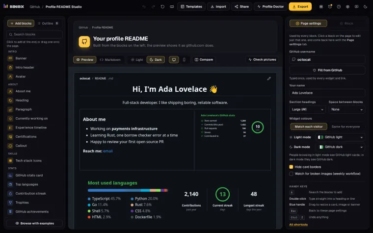
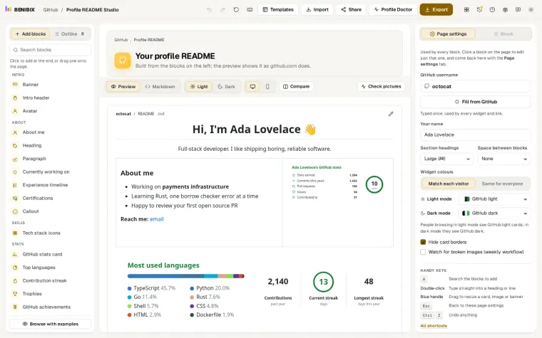
Profile README Studio has 31 layouts and 45 blocks, including all the layouts above, an Open source organization and a Company organization layout, and seasonal ones for Hacktoberfest and Advent of Code. You pick a layout, fill in simple forms, and see your README the way github.com will show it, in light and dark mode, with every badge, icon and card drawn by the studio instead of outside servers.